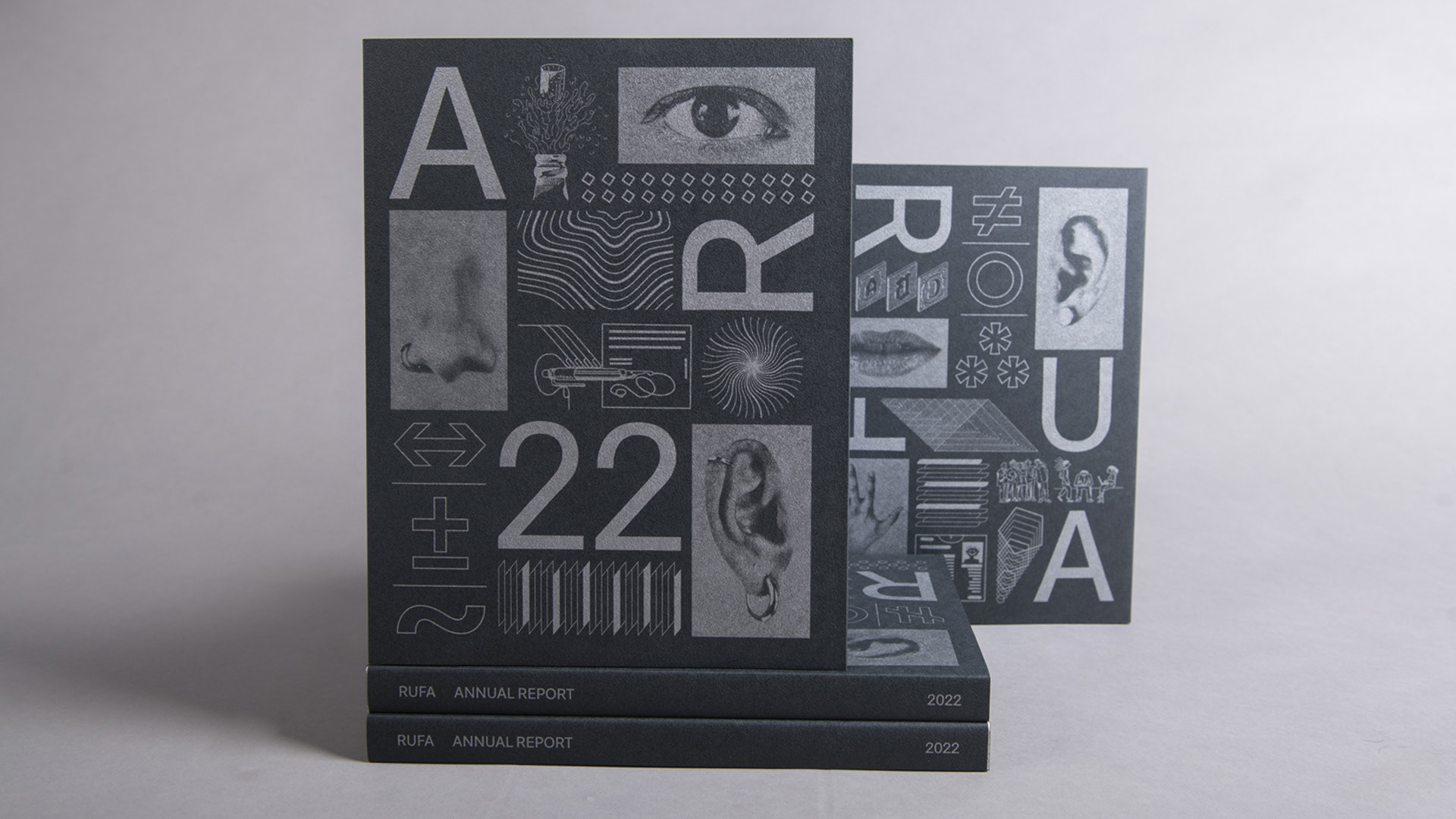
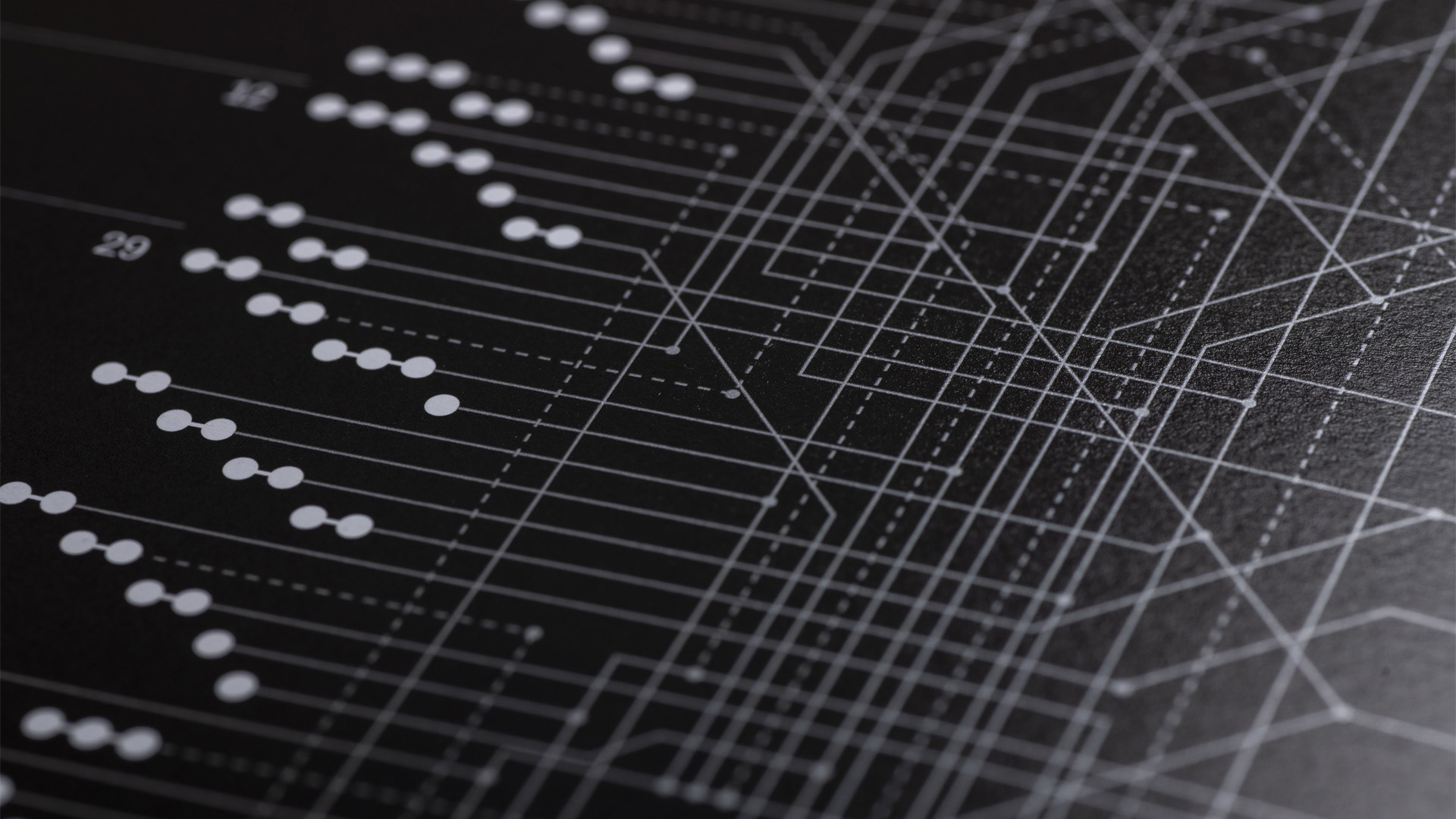
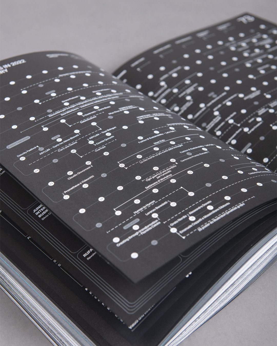
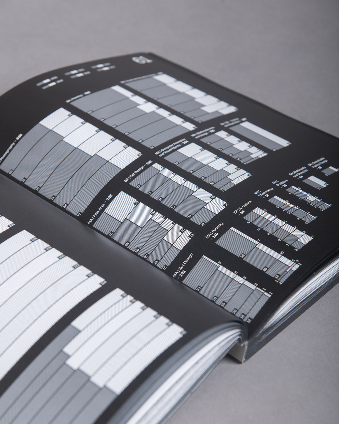
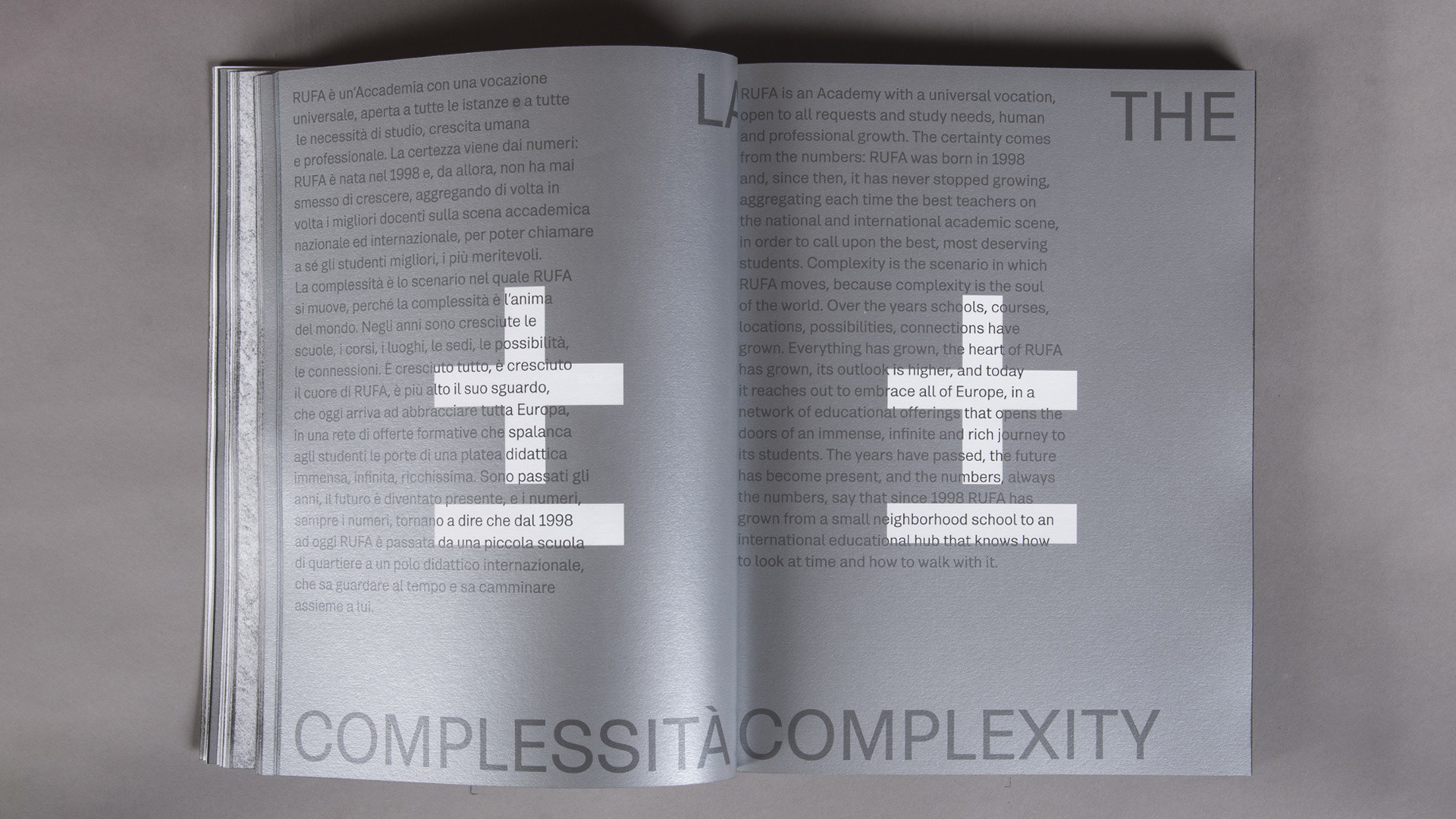
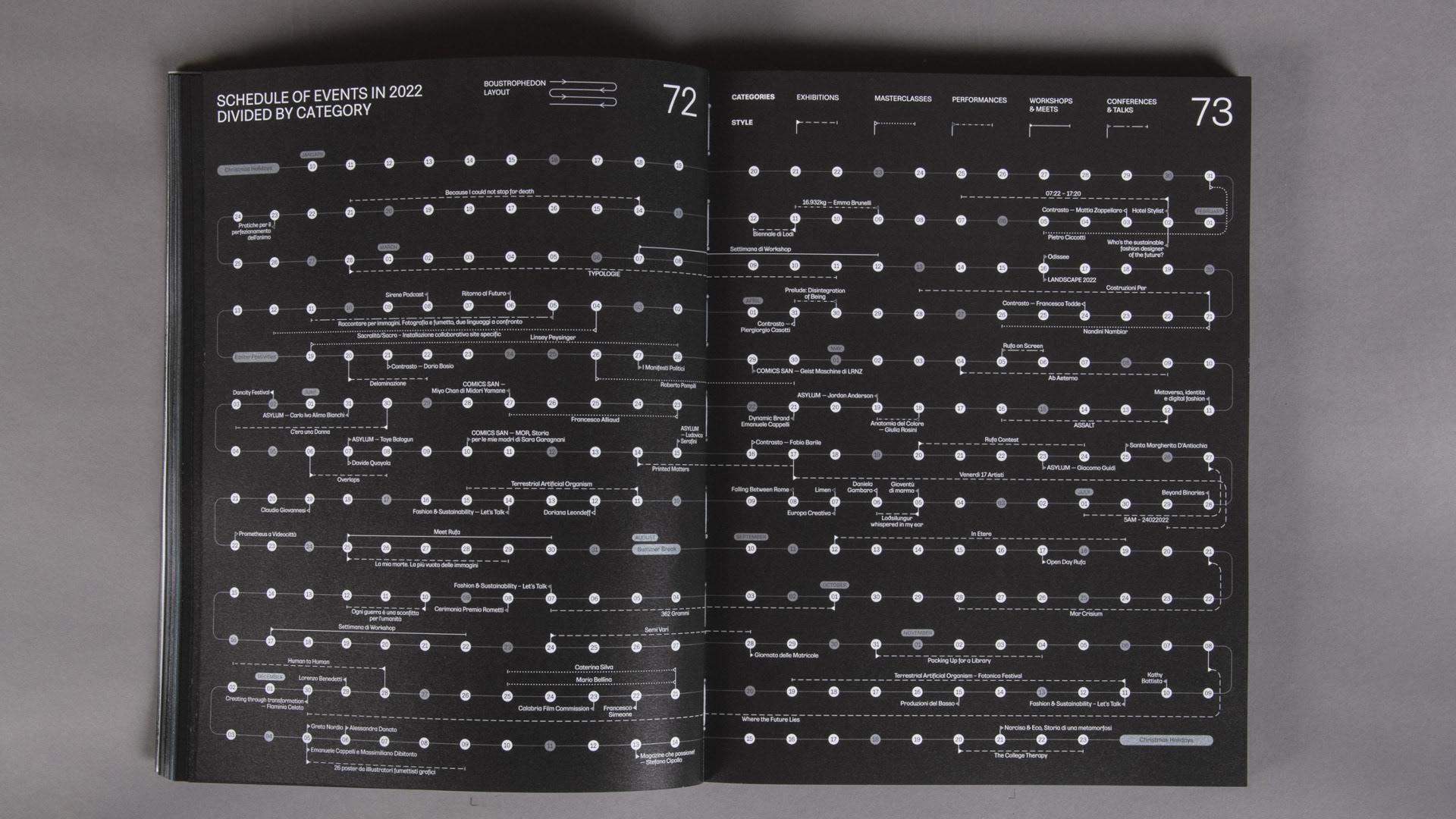
Series of data visualisations for the RUFA Annual Report 22. The work is divided into two types of infographics: the first part, called ‘The Complexity’, consists of seven double-page spreads containing numerical data on the RUFA academy and takes an in-depth look at student and lecturer data, their backgrounds, erasmus destinations, educational offer, the organisational chart and the events held by the academy in the year 2022. The second part includes 10 visualisations that tell about the study plans of the university's BA and MA courses and emphasises the use of organic forms associated with the theme.


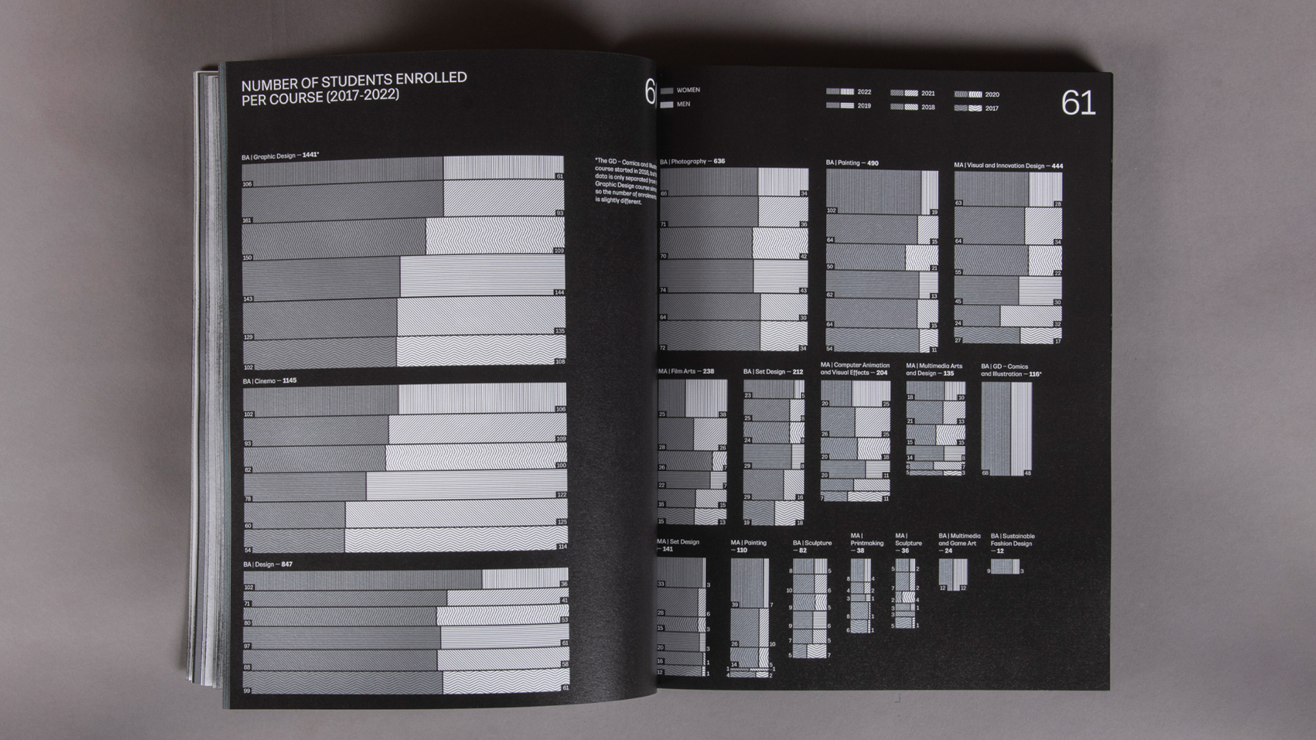
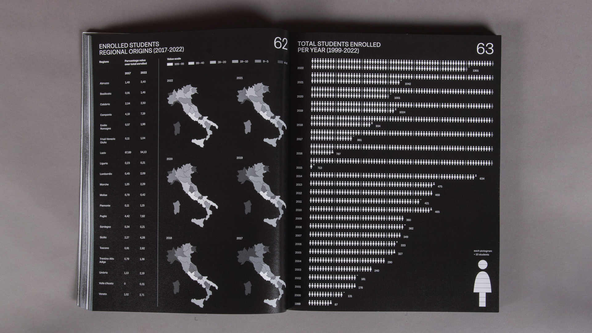
THE COMPLEXITY
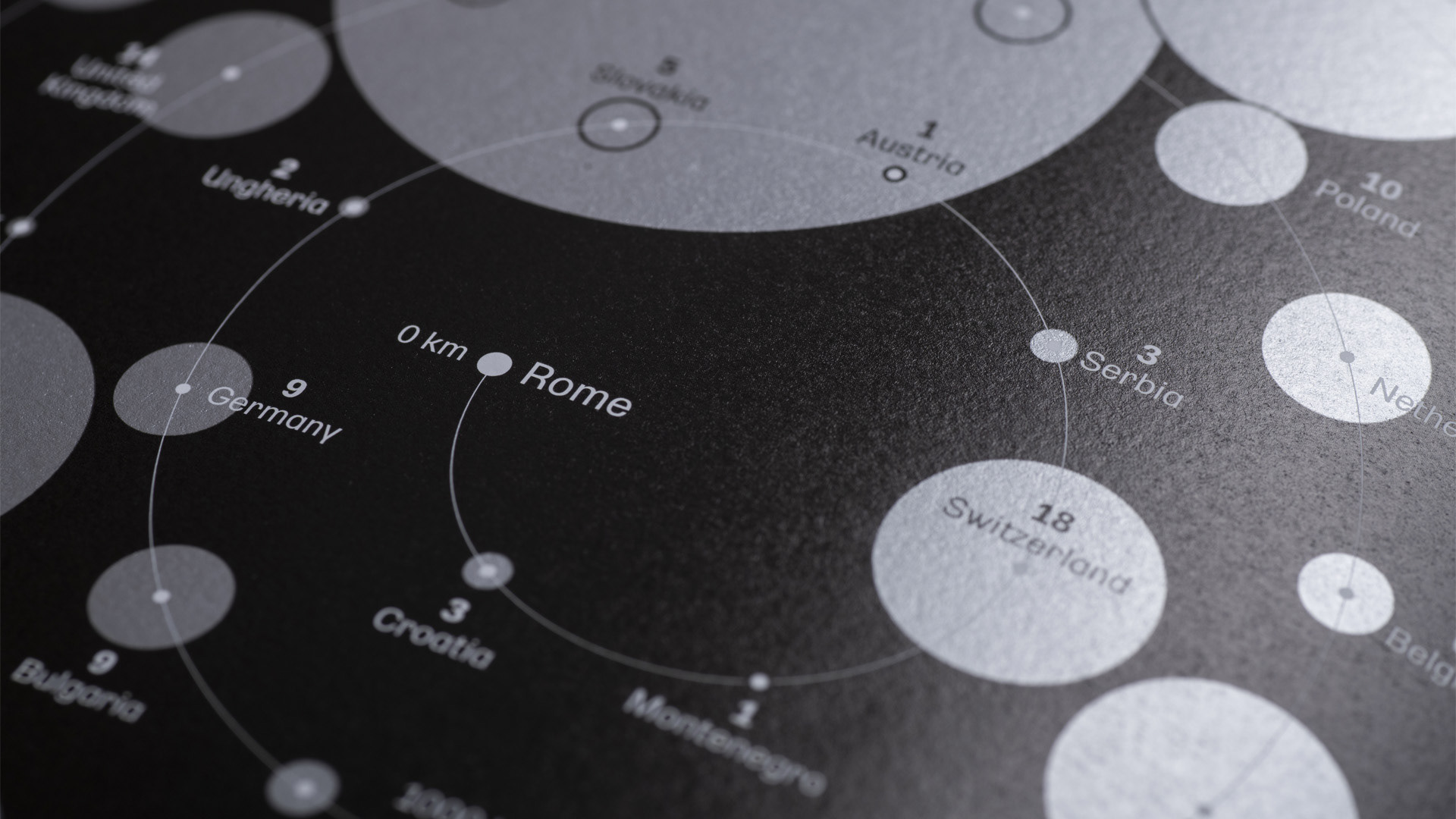
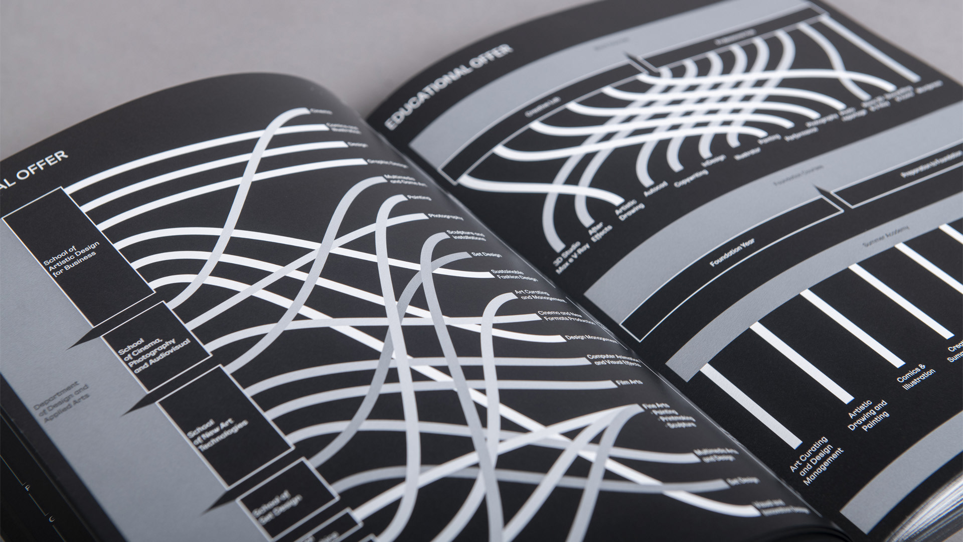
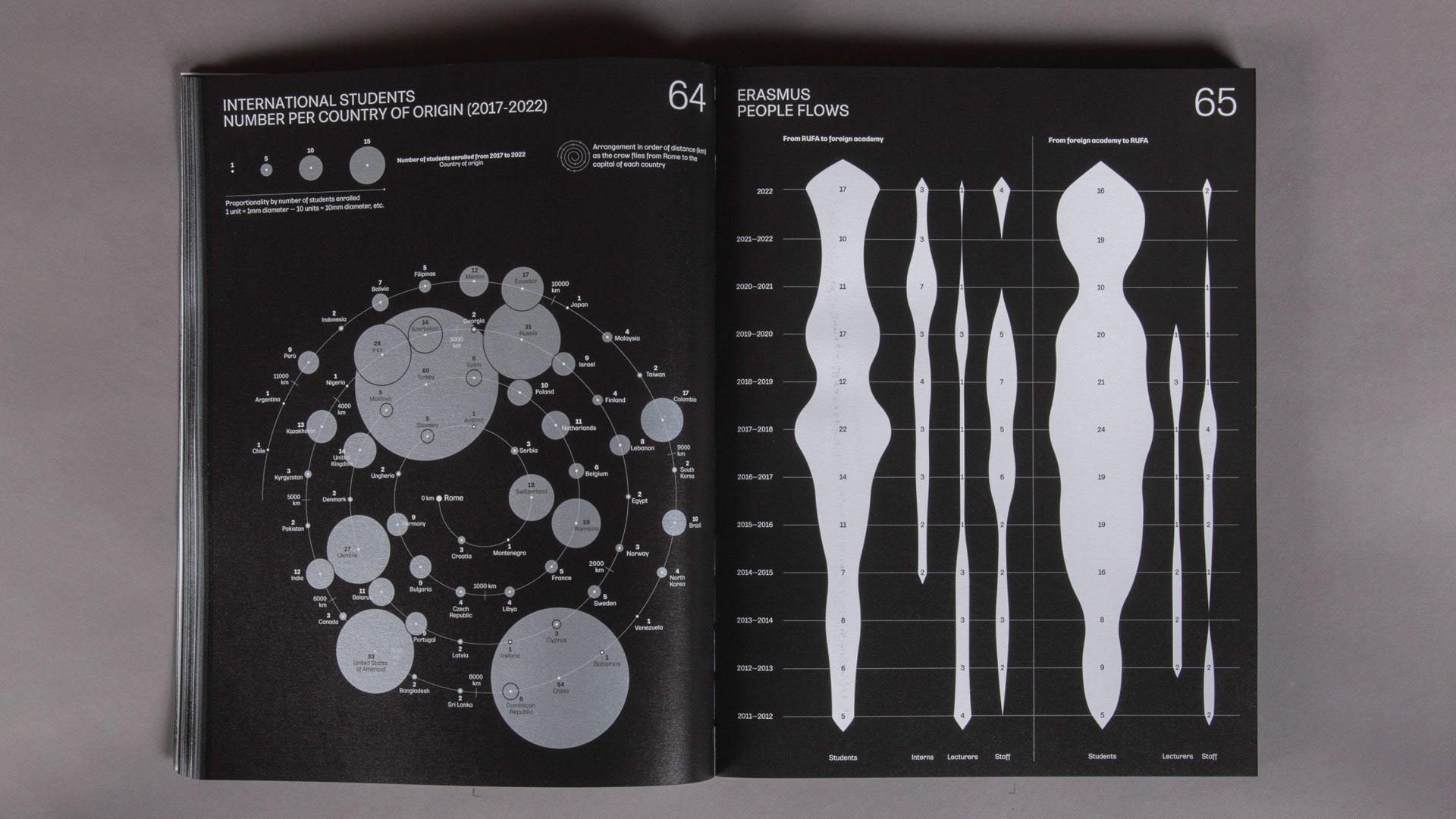
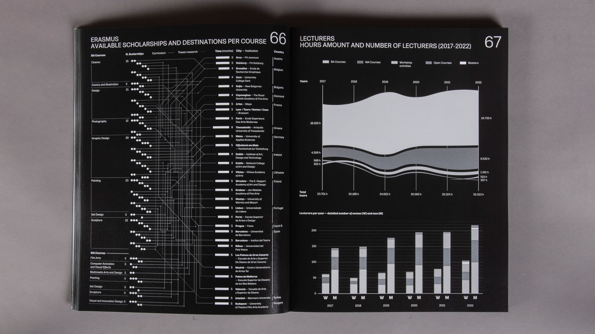
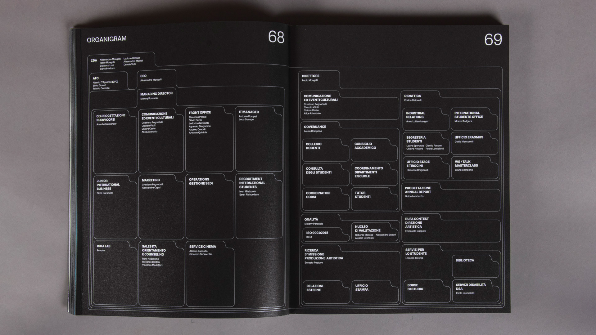
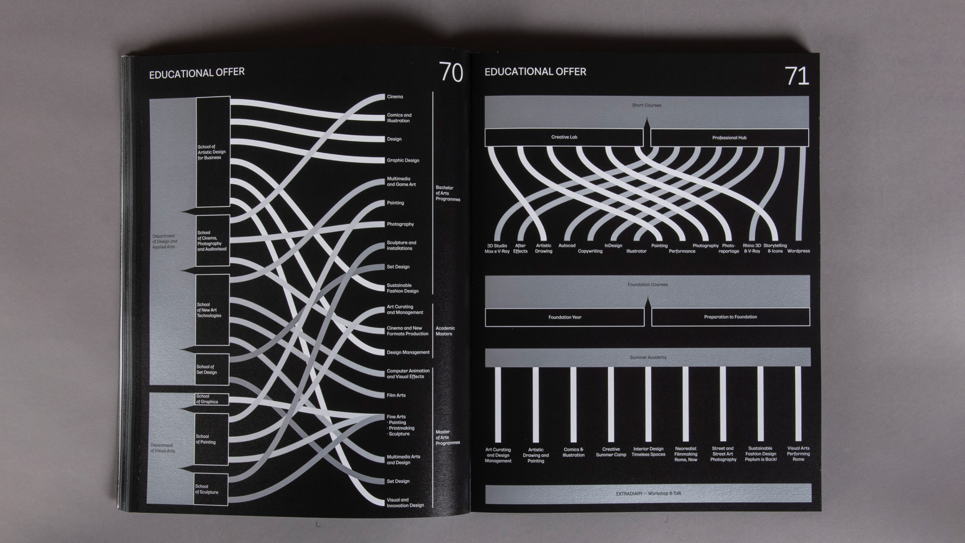
Different types of visualisations were used to narrate the RUFA growth and community: from tree maps to geographical representations, from the Isotype system to flowcharts, from bar graphs to timelines, from customised infographics to narrative visualisations.
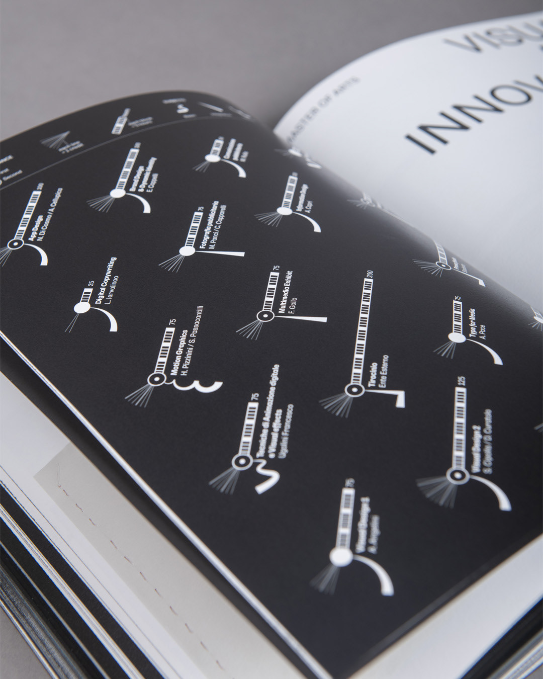
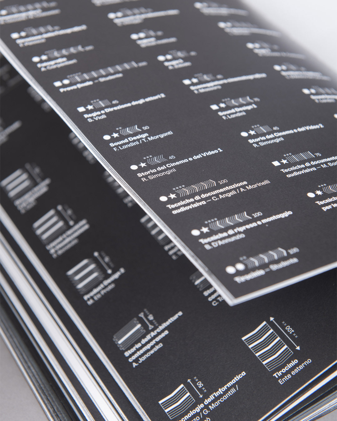
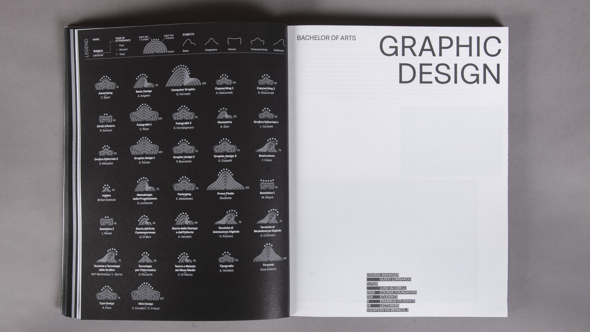
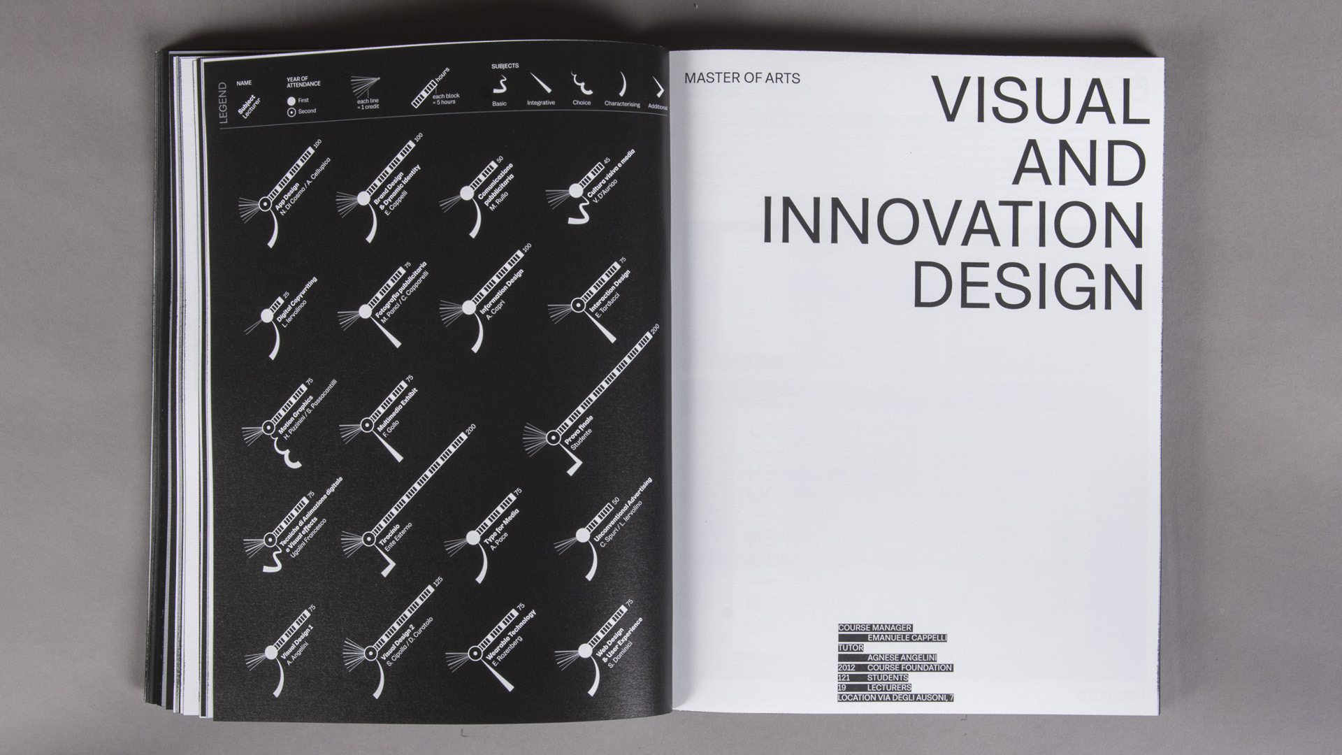
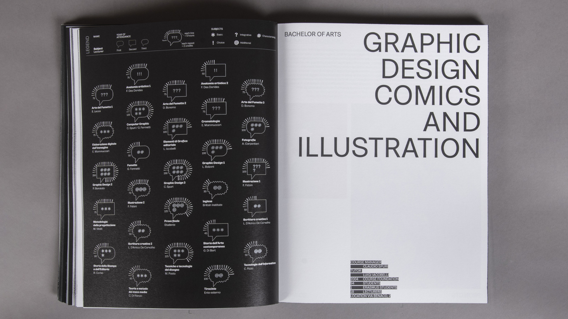
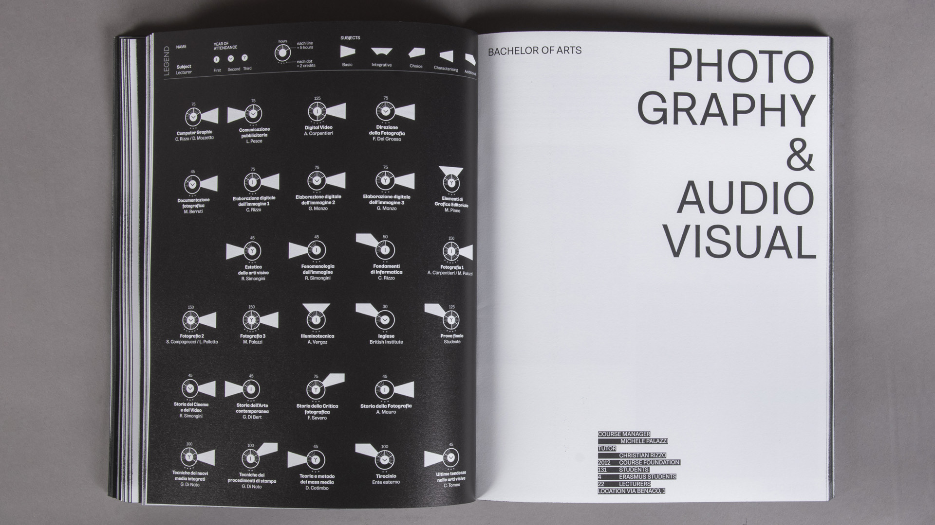
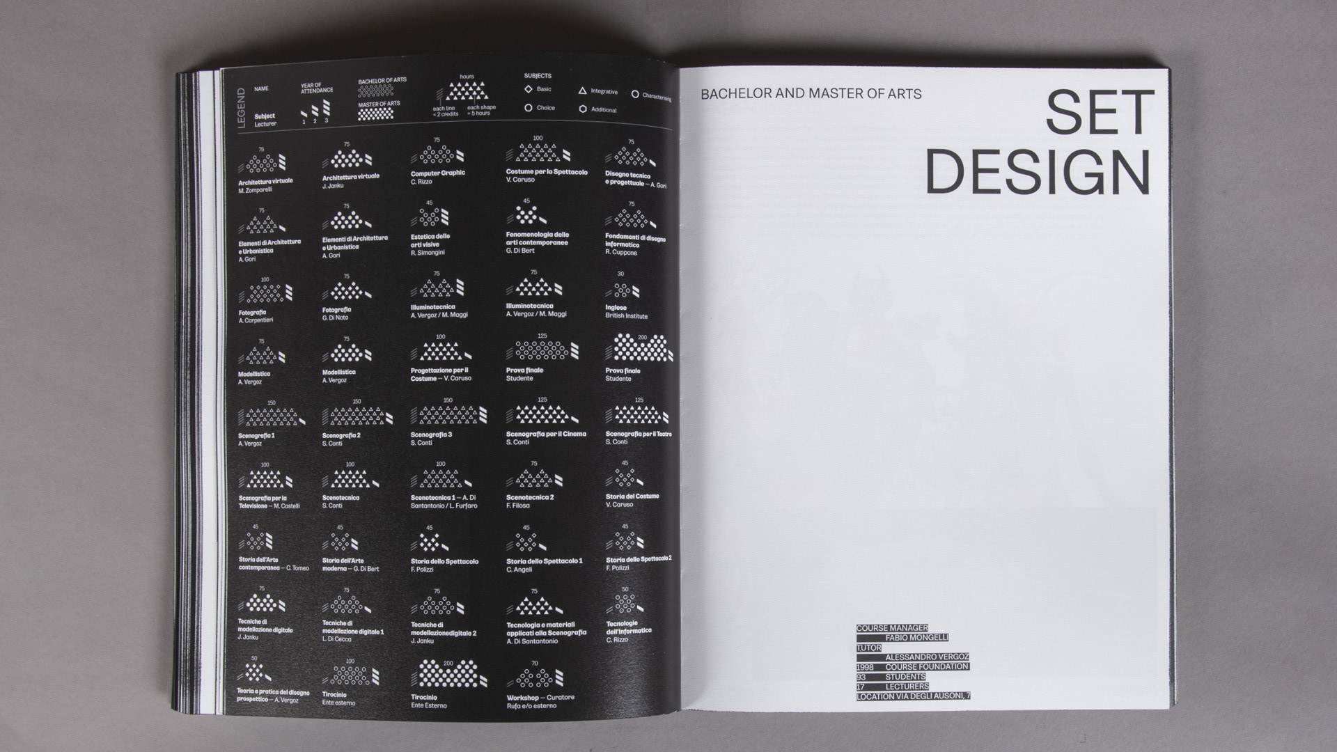
STUDY PLANS
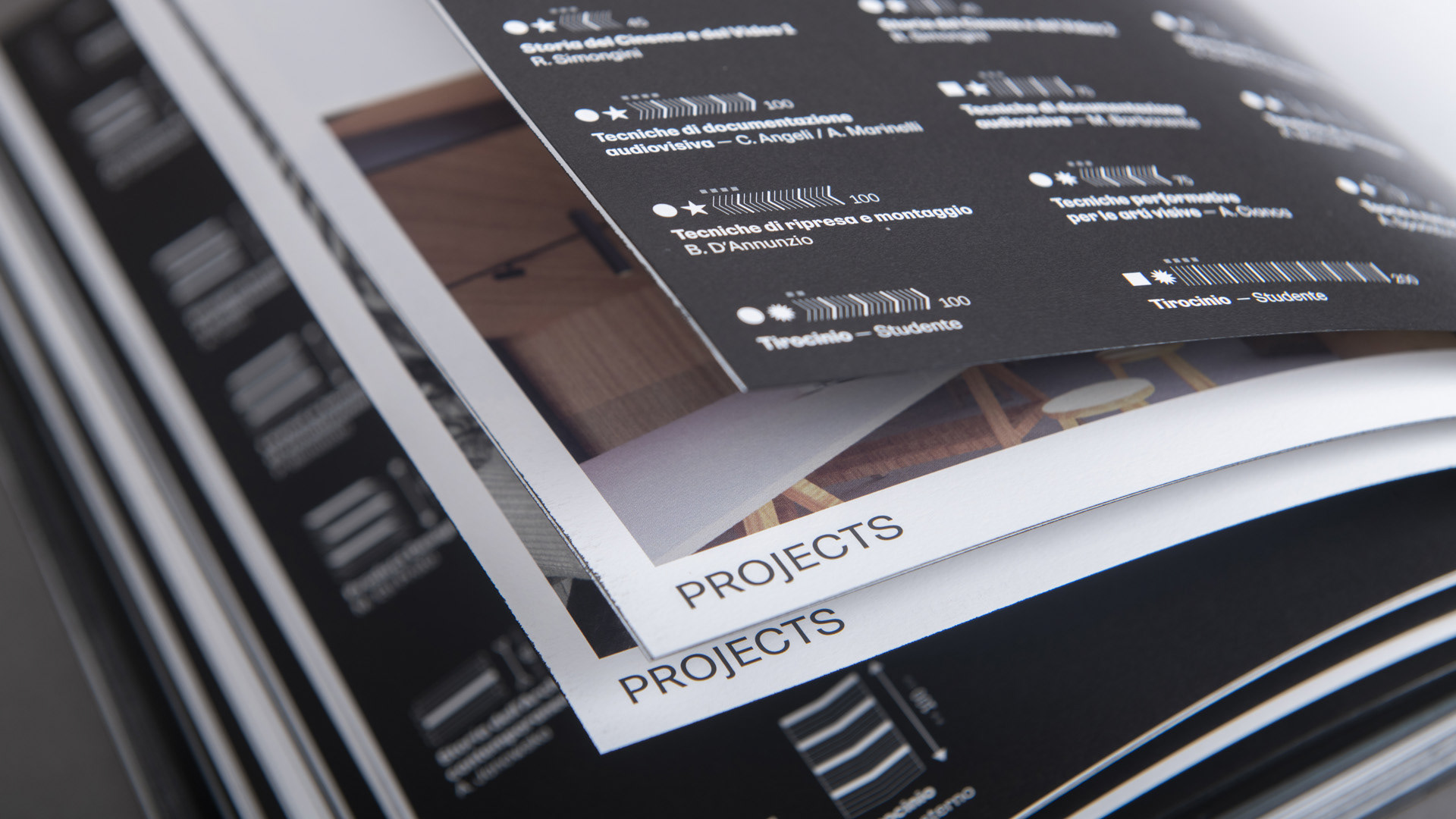
The infographics of RUFA course study plans present very similar datasets but visualised in different forms: the inspiration comes from the subject matter of each course. The main difference is the number of years included in each visualisation with variations ranging from two to twelve years. As the number of subjects to be included in the layout increases, the shape shrinks to fit into the space. The initial legend gives clarity to the reader who can understand the characteristics of the subject, the number of hours, the credits assigned and the year in which the student must study it.


PRESENTATION
For the presentation of the RUFA Annual Report 22, I prepared more than 300 bookmarks. The shapes of the study plan infographics became an individual element and lecturers took home the bookmark with the shape and name of the subject taught. White bookmarks with visualisation pieces of the first part called ‘the complexity’, were produced for the CEO, administration, offices and staff of the academy.
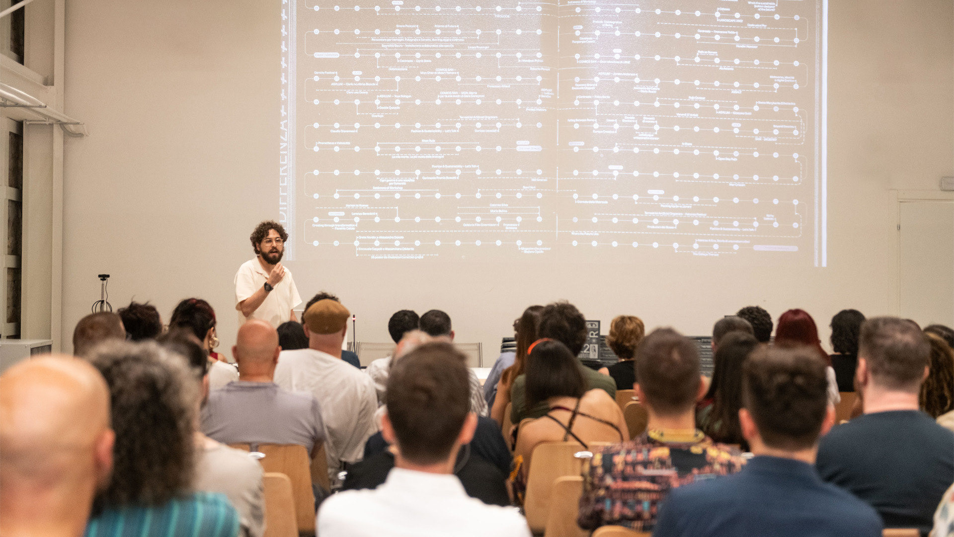

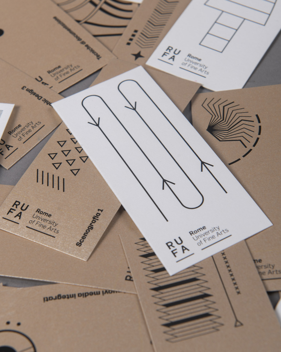
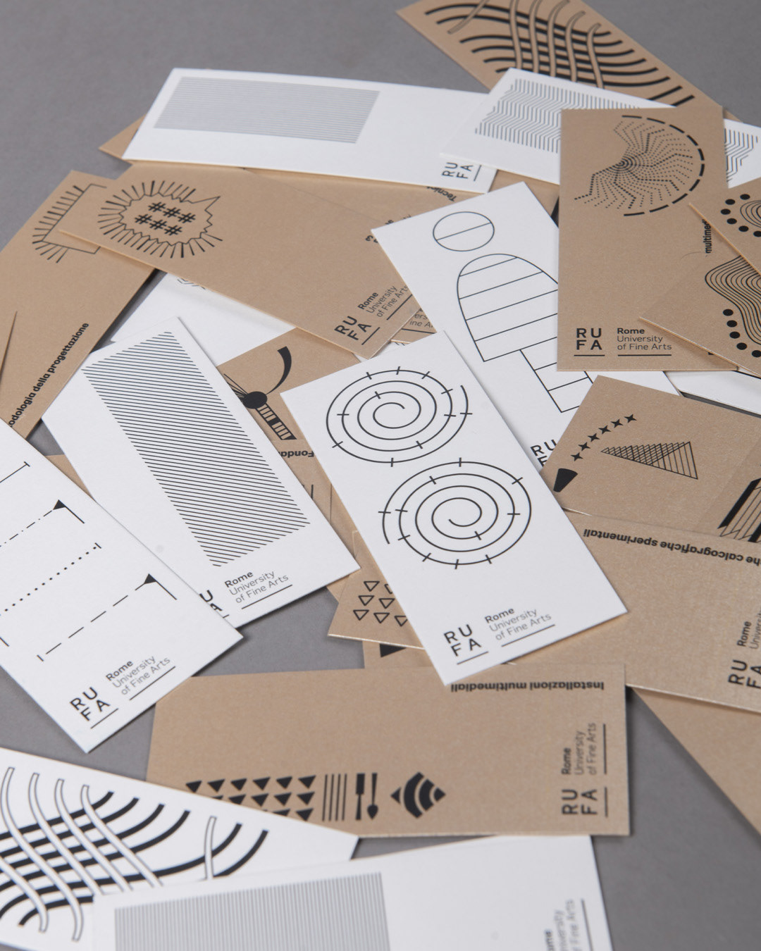
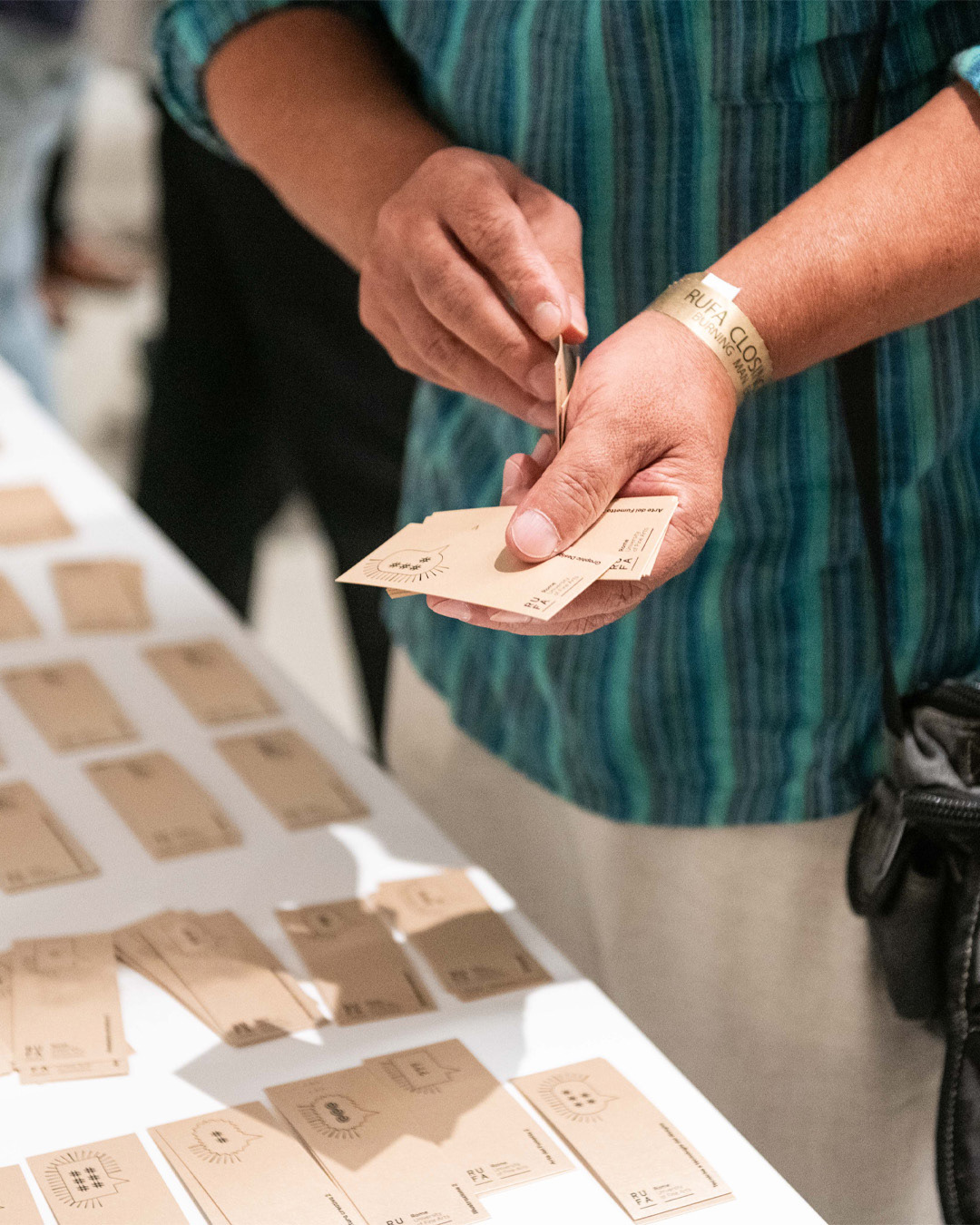

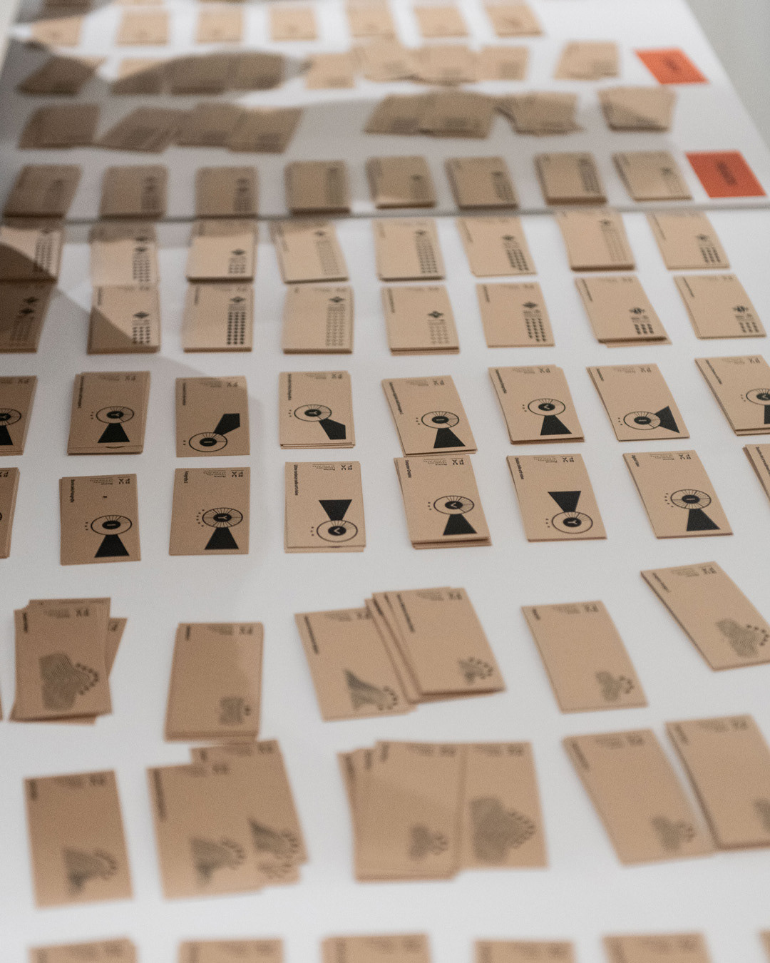
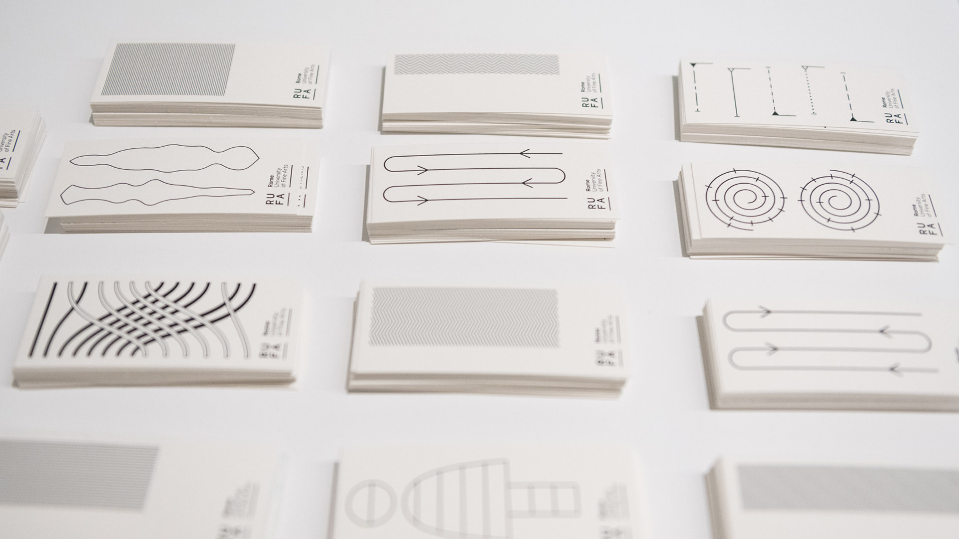
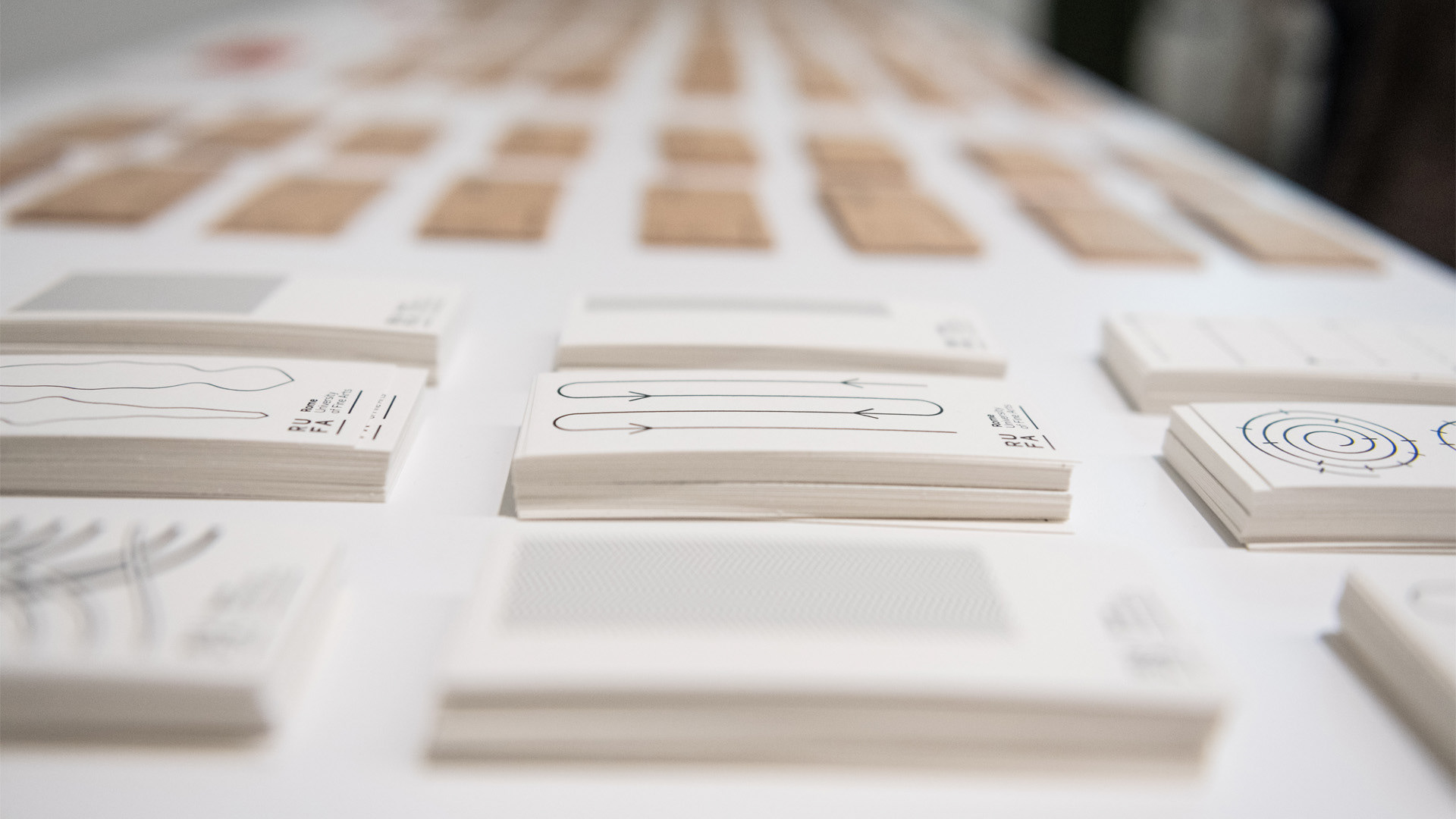
Photo credits Ammodo Studio