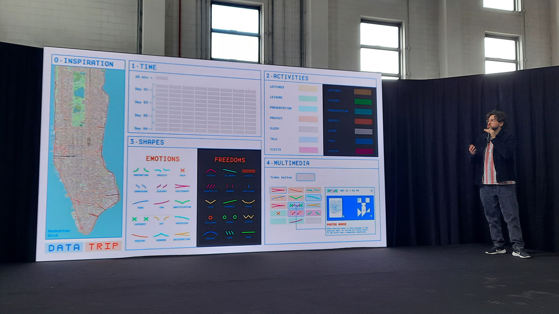
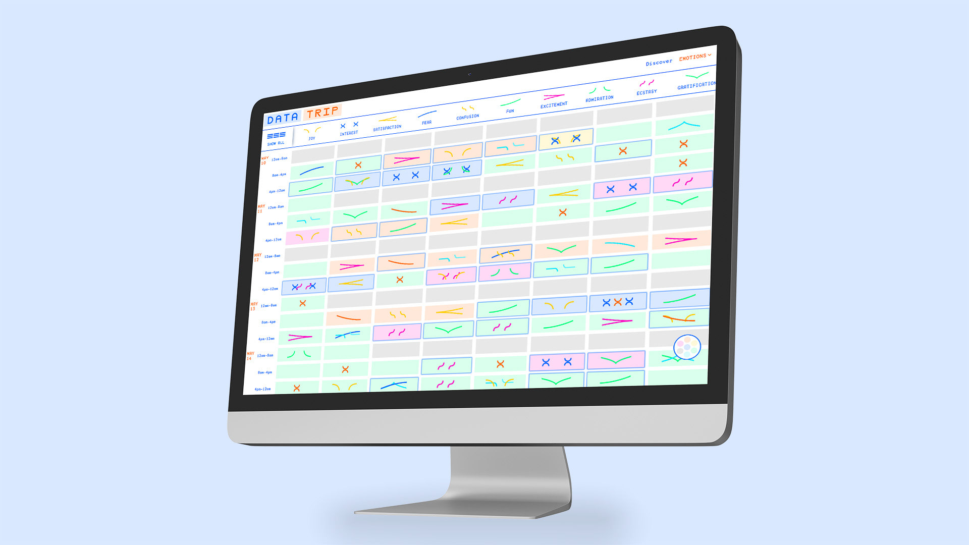
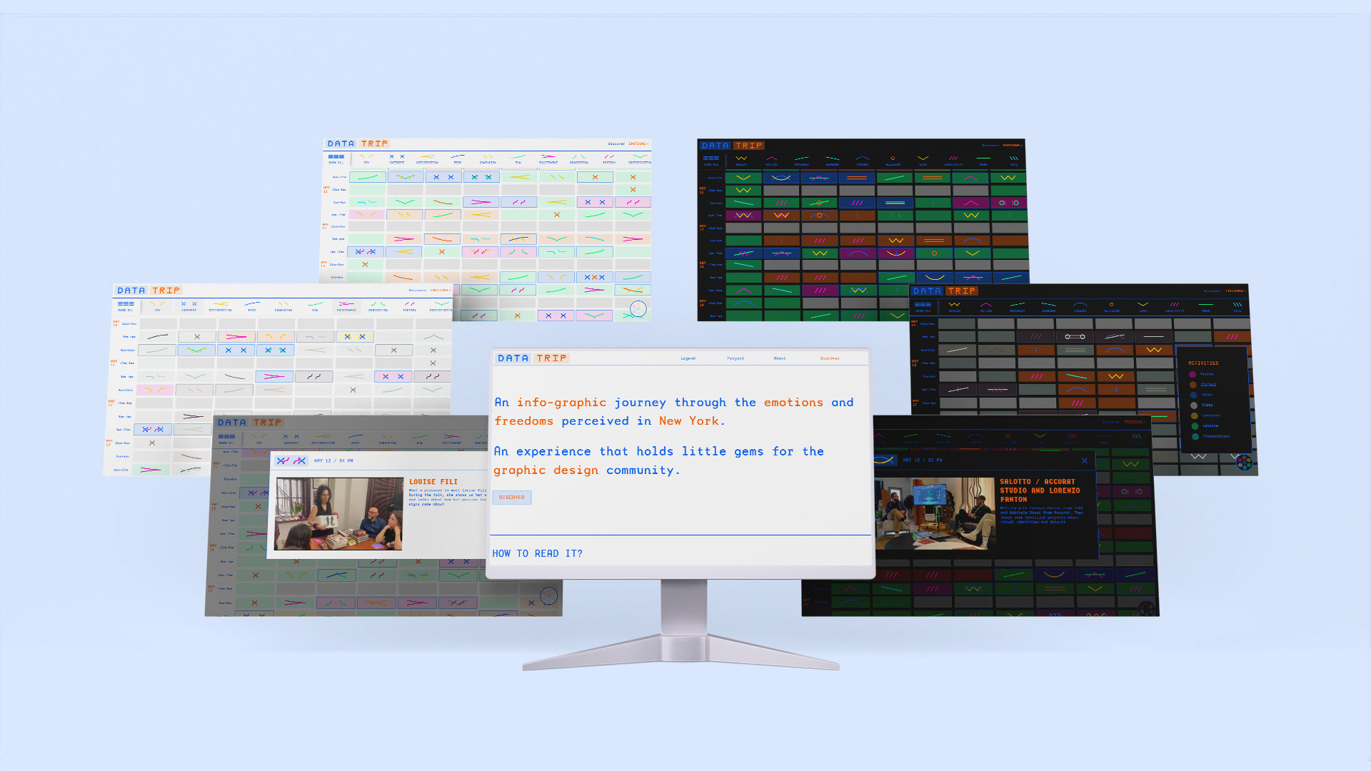
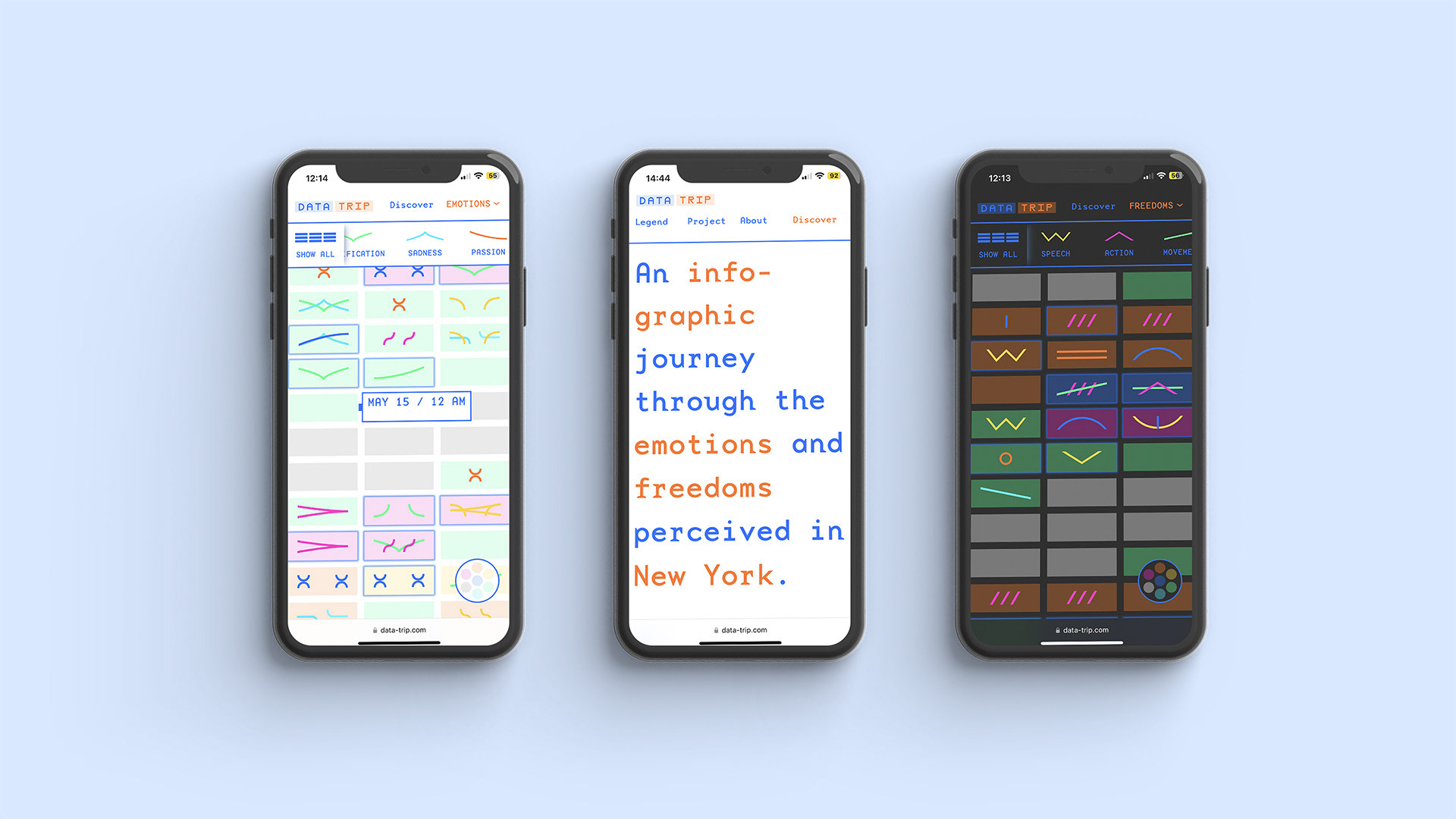
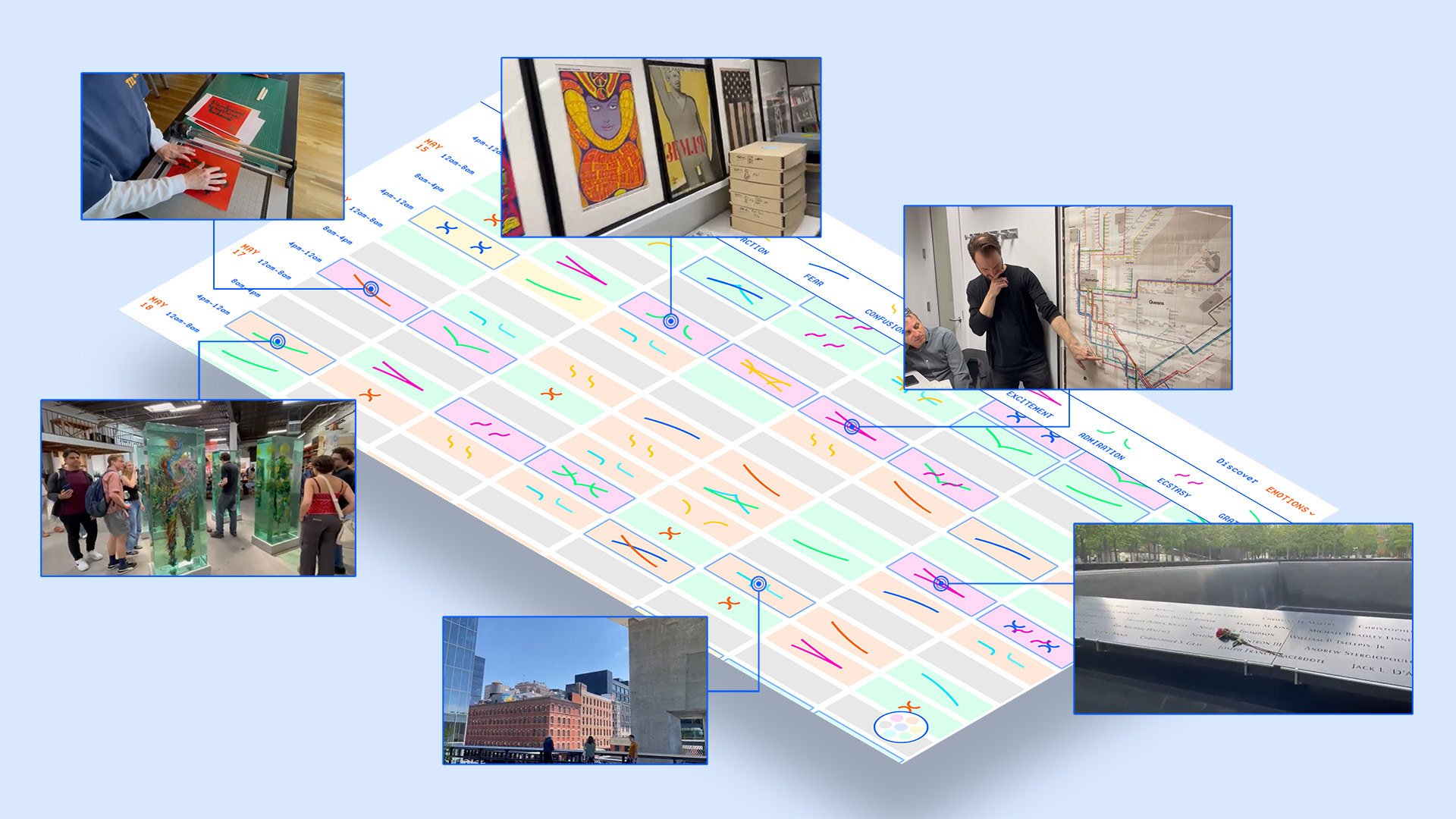
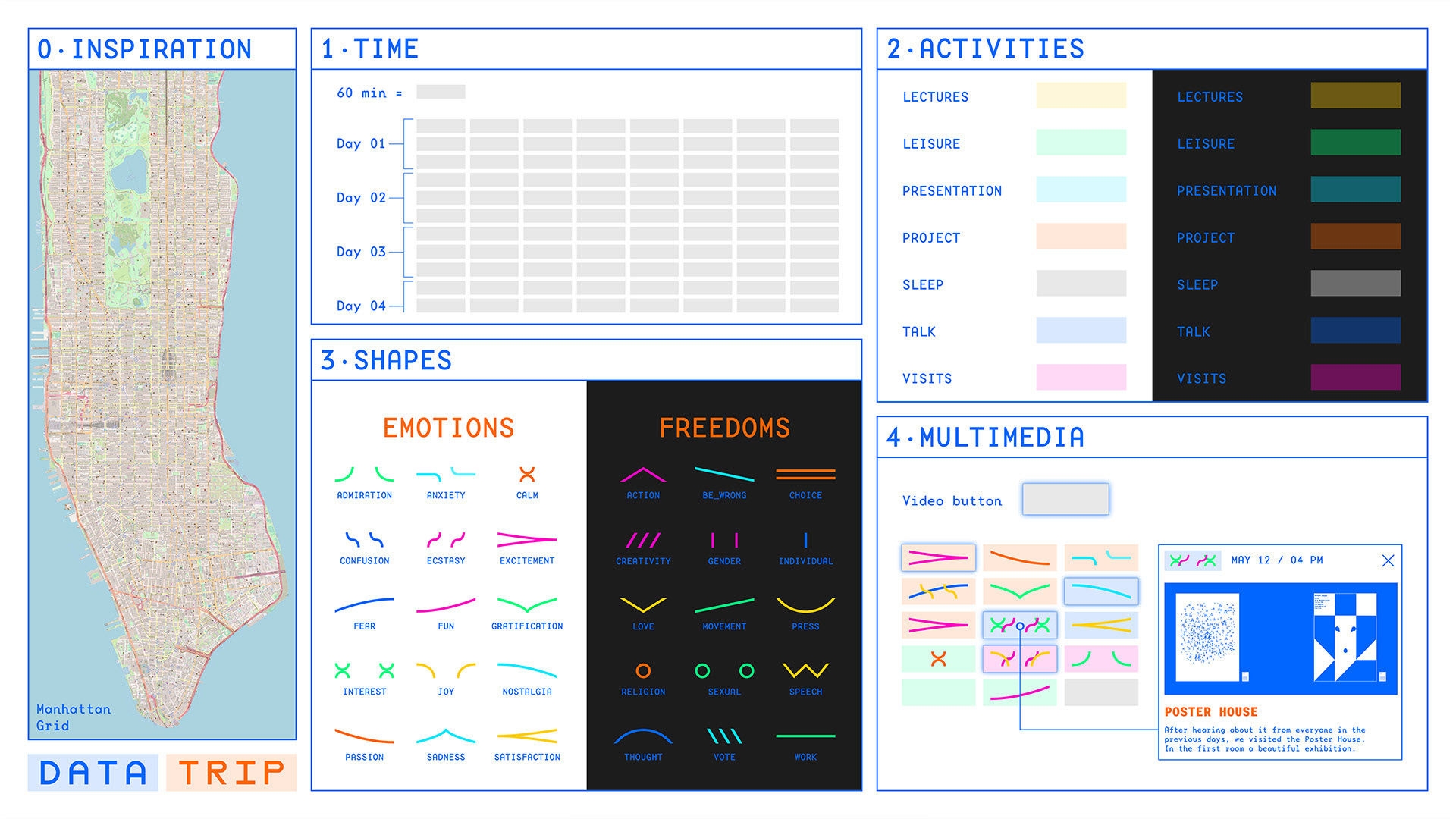
Data Trip is an experimental project combining different approaches of data visualization. The design basis follows the influences of data humanism and investigates the emotions experienced during a trip by trying to rationalise the experience and map it in a grid marked by time. A second level of information catalogues the freedoms perceived in one of the world's largest metropolises: New York. The historical inspiration of the development of cartography following the discovery of America, the theme of the transatlantic crossing, the logbooks of the sailors who first sailed unknown seas and drew maps of the new world, developed a perfect parallelism with what would have been an intercontinental voyage in search of the tracks of freedom.
Delving into the infographic reveals further layers of quantitative data, different from the earlier thick data. The colour scheme draws up a calendar of activities carried out during the time spent in the United States and gives a precise picture of the schedule that the team had to adhere to. Finally, the innermost and most difficult level hides little gems for graphic design enthusiasts: through video testimonies, collected in first person, the New York design community and the spaces in which they move are recounted and documented.
The interactive output allows open source and personalised consultation to those who browse Data Trip.
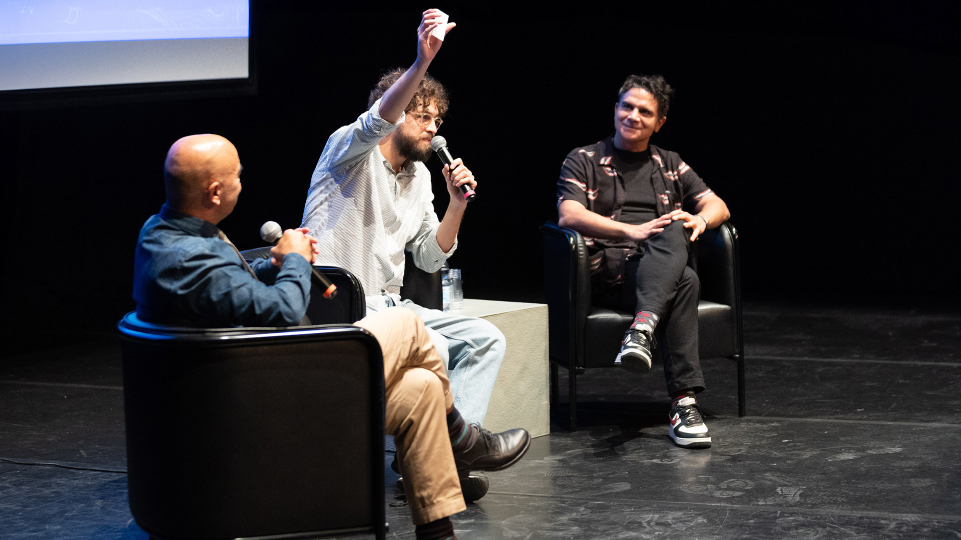
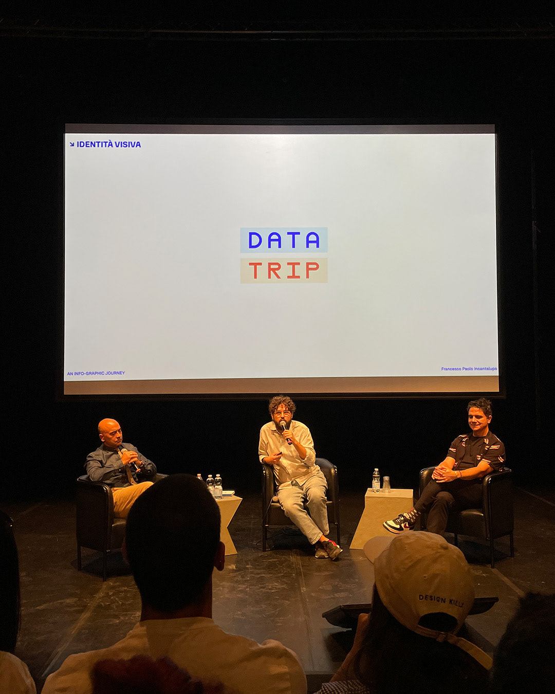
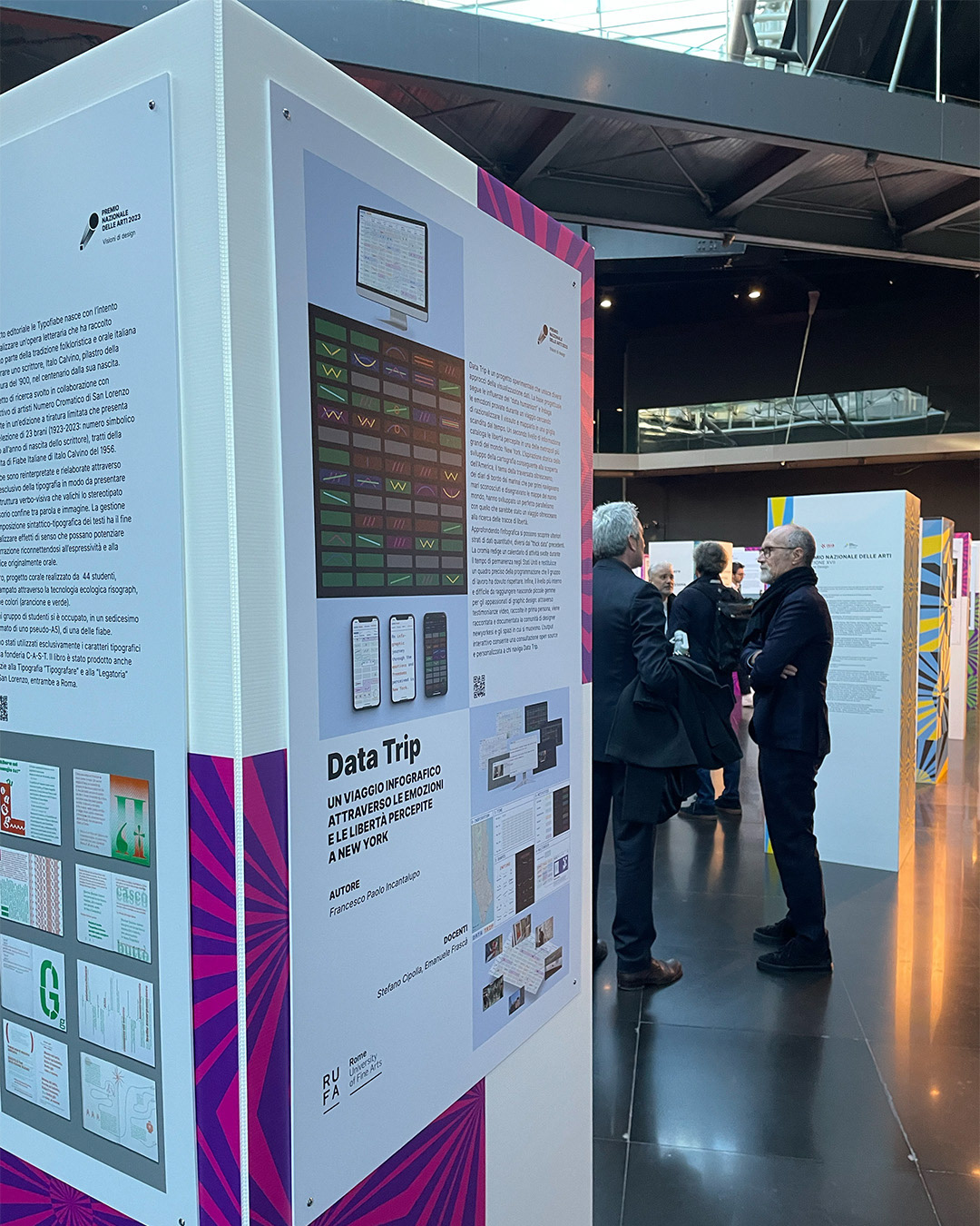
DATA TRIP was presented at the Romaeuropa Festival 2024 Design Talks, at Aiap Big Community during the Biennale Internazionale Grafica in Milan and was exhibited at the MACRO museum during the Premio Nazionale delle Arti 2023